Tutorials (Bangladesh Case Study)
This section provides step-by-step instructions on how to use the RiskChanges platform through a Bangladesh-based case study. Each section is accompanied by a detailed video walkthrough to support learning and hands-on exploration.
About the Demo Dataset
To support learning, testing, and demonstration of the RiskChanges platform, this tutorial uses a demo dataset based on Bangladesh, with a thematic focus on the power sector.
The dataset is designed to demonstrate RiskChanges’ workflow, from data ingestion and exposure calculation to loss estimation, risk analysis, and comparison of future climate scenarios, without requiring users to upload their own data at the initial stage.
Bangladesh is selected as a case study due to its high exposure to climate-related hazards, including floods, coastal flooding, and wind storms, as well as the critical role of energy infrastructure in supporting socioeconomic resilience. By using a real-world geographhic context and realistic data structures, the dataset enables users to explore how RiskChanges can be applied to infrastructure risk assessment and climate adaaptation planning.
While the dataset is simplified for tutorial purposes, it closely mirrors the data organization, formats, and metadata requirements expected when working with user-provided datasets in the RiskChanges platform.
The table below summarizes the contents of the demo dataset and their respective sources.
Note
The data provided in this tutorial is intended solely for demonstration and training purposes. While it reflects realistic structures and plausible values, it should not be interpreted as an official risk assessment for Bangladesh.
👉 Please refer here to access the dataset for this tutorial.
Step-by-step Walkthrough
Let’s now go through the core tasks you’ll perform on the RiskChanges platform.
1. User Registration and Profile Setup
To begin working with RiskChanges, users must first create an account and configure their profile. This step establishes user identity, access rights, and project participation, forming the foundation for collaborative workflows within the platform. To register an account, go to RiskChanges website: http://riskchanges.org/.
Follow this guide to create your account and set up your profile.

Register to RiskChanges
Click the Explore RiskChanges button on the top-right corner of the website.
Click Register Here on the bottom part below the Login form.
Fill in the Registration form with your name, email address, and password, and click Register.
Check your email and verify your account. In case no email comes to your inbox from RiskChanges, please check your Spam folder.
Login to your new account with your email and create a password. It will take you to the main dashboard of your RiskChanges account, the Project Dashboard.
Click the name and three options will be shown which are Update Profile, Change Password, and Logout. By clicking each of those, you can update your profile, change your password, and logout.

Profile and Project Dashboard
2. Create a Project
Once registered and logged in, the next step is to create or access a project. Projcets act as containers for all datasets, analyses, and results. Every exposure, loss, and risk calculation in RiskChanges is performed within a project context, making this step essential before any data can be uploaded or processed.
The Project Dashboard consists of the list of projects that the users have created or have been assigned to. Aside from that, in this dashboard users can also filter and search a specific project by name, study type, hazard type, or sorting the project.
Click New Project to be redirecte to the Add New Project page.
There are four pages to be filled related to the project, which are:
 ,
,  ,
,  , and
, and  . Only the General section is required for now.
In the
page, users need to enter related details about the project.Project Name: Bangladesh Power Sector Assessment
Study Area: Bangladesh
Description: Power system infrastructure risk assessment under multiple scenarios.
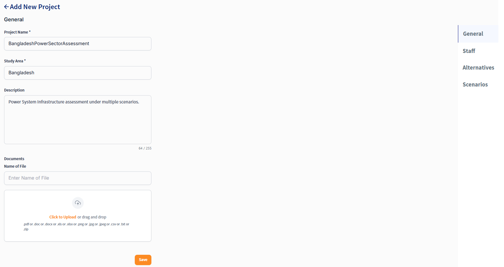
Filling General section
The
page allows users to invite and design the team members in the associated project. The projects that are created or assigned to the user are displayed as cards in the Project Dashboards and can be filtered easily through the filter function.
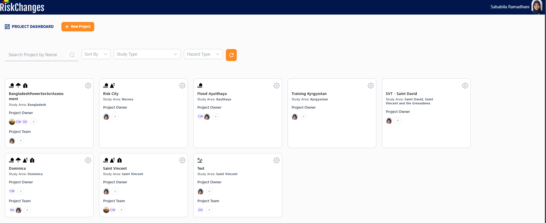
Project Dashboard
The
page allows users to define different alternatives for the project. Alternatives can represent different development pathways, infrastructure designs, or policy options that may impact risk outcomes.The
page allows users to define different scenarios for the project. Scenarios can represent various future conditions, such as climate change projections, socioeconomic developments, or hazard event characteristics.
3. Upload and Visualize Datasets
After creating a project, users can begin populating it with data. RiskChanges follows a structured data input sequence to ensure consistency and traceability across analysis. In general, users start by uploading adminstrative boundaries, followwed by hazard layers, elements-at-risk datasets, and finally vulnerability data. Each dataset is immediately visualized to allow verification before proceeding to the next step.
Administrative Boundary Data
Administrative boundaries provide the spatial units for aggregating exposure, loss, and risk results. Uploading these datasets early ensures that subsequent analyses can be summarized at meaningful governance or planning levels, such as districts or municipalities.
From Project Dashboard, choose the project you will work on and click on the project name.
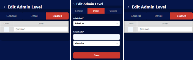
Choose Admin Level and click Add Admin Level.
In the General section, upload your administrative boundary shapefile in a zipped folder.
Click to Upload or Drag and Drop the administrative boundary data to upload the file.
Type in Name and click Save to apply.
Name: Bangladesh Division (depending on which dataset, you can name it as Bangladesh Province, Bangladesh Districts, or Bangladesh Sub-Districts).
Label Field: [Adm1 en] for division, [Adm 2 en] for province, [Adm3 en] for districts, or [Adm4 en] for sub-districts.
Color Map: antiquewhite.
Label: Administrative Unit.
The administrative boundary will be automatically loaded in the map canvas with a single symbol styling. Users can change the visualization and symbology of the map view by going to the Detail tab.
Administrative Boundary Data Upload Settings

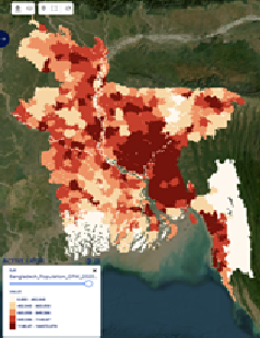
Bangladesh Administrative Boundary
Hazard Data
Hazard layers define the spatial extent and intensity of natural hazards and are a critical input for exposure assessment. In the demo dataset, multiple hazard types and return periods are used to demonstrate how RiskChanges supports both single-hazard and multi-scenario analysis.
Go to Hazard and click Add Hazard.
In the General section, upload your hazard data. The data must be in either a GeoTIFF or shapefile (in a zipped folder) format. Other options are soon to be available which are to connect to OGC Service or global datasets.
Click to upload or drag and drop the hazard data to upload the data.
Type in the Layer Name, Hazard Type, Hazar Sub Type, Hazard Intensity Type, Hazard Intensity Unit, Return Period (years), Representation Year, Risk Reduction Alternative (if applicablr), and Scenario (iff applicable).
Note
Representation years can be adjusted based on available layers (2030, 2050, 2080).
Multiple scenarios are supported where available: SSP126, SSP245, SSP370, SSP585.
Default scenario is SSP126 unless otherwise specified.
Click Save and the hazard layer will be automatically displayed in the map canvas.
The default styling is a User Defined Classes (graduated) for raster data. Whereas for vector (shapefile) datasets, if the hazard intensity type is Susceptibility, the default style is Automatic Classes (categorized).
Hazard Layer Settings
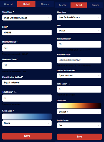
The Detail section is used to adjust the settings for the layer’s visualization. Additionally, the chosen style will also be applied as the base classes for Exposure calculation.
Select the Class Mode whether it is Single Class, User Defined Classes, or Automatic Classes.
For Single Class, users need to select the dataset’s Field which will be used as well as the Minimum Value and Maximum Value to be displayed. Then, a Color Map will be selected for the visualization.
For User Defined Classes, after selecting the dataset’s Field, Minimum Value, and Maximum Value, Total Class neds to be defined as well as the ** Classification Method** (options available are equal interval, quantile, natural breaks, standard deviation, geometric interval, logarithmic scale, and percentile). A Color Map needs to be selected as well for visualization.
Note
All layers use User Defined Classes with equal interval classification.
The [VALUE] field is used for symbology across all hazard layers.
Click Save.
Users can also go to the Symbology section to adjust the layer’s labels.
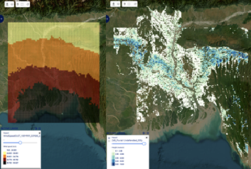
Bangladesh Hazard Layer Visualization
Element-at-Risk (EaR) Data
Elements-at-risk represent the assets, population, and infrastructure that may be affected by hazards. Uploading these datasets allows RiskChanges to spatially link hazards with exposed features and, later, to estimate potential losses. Careful definition of attributes at this stage is essential, as these fields are directly used in exposure and loss calculations.
Go to EaR and click Add EaR.
In the General section, upload your EaR data. The data must be in either GeoTIFF or shapefile (in a zipped file) format. Other options are soon to be available which are to connect OGC Service or global datasets.
Click to upload or drag and drop the EaR data to upload the data.
Type in the Layer Name, Elements-at-Risk Type, Element-at-Risk Subtype, Representation Year, Risk Reduction Alternative (if applicable), and Scenario (if applicable).
Click Save and the uploaded EaR layer will be automatically displayed in the map canvas. The default styling is single symbol.
Population Layer
Attribute |
Value |
|---|---|
Baseline Year |
2020 |
Scenarios |
SSP126, SSP245, SSP585 |
Representation Years |
2030, 2050, 2080 |
Population Types |
Urban, Rural, Total |
Layer Name |
TotalPopulation_Baseline_2020 |
Element at Risk Type |
Grid |
Element at Risk Sub |
Population |
Representation Year |
2020 |
Substations Layer
Attribute |
Value |
|---|---|
Layer Name |
Substations |
Element at Risk Type |
Polygons |
Element at Risk Sub |
Other |
Other Sub Type |
Substation |
Representation Year |
2020 |
Critical Power Plants Layer
Attribute |
Value |
|---|---|
Layer Name |
Power Plant |
Element at Risk Type |
Polygons |
Element at Risk Sub |
Other |
Other Sub Type |
Power Plant |
Representation Year |
2020 |
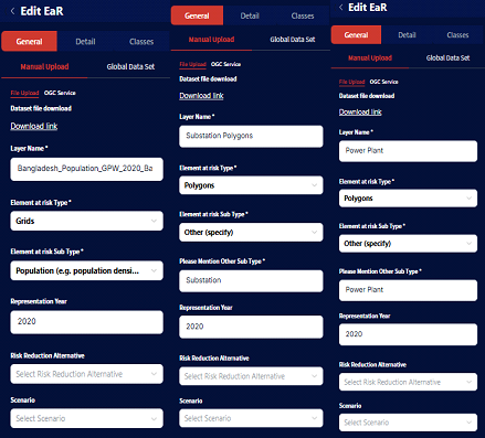
Bangladesh Elements-at-Risk Upload Settings
The Detail section is used to adjust the settings for the layer’s visualization. Additionally, the chosen style will also be applied as the base classes for Exposure assessment.
Select the Class Mode whther it is Single Class, User Defined Classes, or Automated Classes.
For Single Class on shapefile dataset, users need to select the Nolor Map for the visualization. An additional option t Enable Stroke is also available.
For ** Automatic Classes** and User Defined Classes on shapefile datasets, users select the dataset’s field to be used for visualization, Area Field, Area Field Unit, Value Field, Value Field Unit, Population Field, Population Field Unit, and Other Field as well as Other Field Unit. These fields are important and need to be selected in order to calculate the Loss.
A Color Map needs to be selected as well for visualization. An additional option to Enable STroke is also available.
Population Layer
Attribute |
Value |
|---|---|
Class Mode |
User Defined Classes |
Field |
[VALUE] |
Minimum Value |
0.001 |
Classification Method |
Equal Interval |
Total Classes |
5 |
Color Scale |
OrRd |
Substations Layer
Attribute |
Value |
|---|---|
Class Mode |
Single Class |
Color Scale |
blue |
Building Footprints Layer
Attribute |
Value |
|---|---|
Class Mode |
Single Class |
Color Scale |
darkmagenta |
Users can also go to the **Symbology section to adjust the layer’s labels.
Bangladesh Elements-at-Risk Layer Symbology Settings
Bangladesh Elements-at-Risk Layer
- ..note::
Please note that the Vulnerability data is necessary for LOss and Risk calculations. The Exposure calculation does not require Vulnerability input. Therefore, if users only need to do Exposure assessment, entering Vulnerability data is not compulsory.
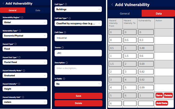
Vulnerability Table
While exposure identifies what is affected, vulnerability defines how severely it is affected. Vulnerability data links hazard intensity to expected damage or population impact and is therefore a prerequisite for loss and risk calculations. In the demo dataset, pre-defined vulnerability tables are provided to streamline the workflow.
Go to Vulnerability and click Add Vulnerability.
Users can upload a CSV file under the General section to add a record automatically or input the values directly under the Data section.
The uploaded CSV file needs to have information of Hazard Intensity Form, Hazard Intensity To, and Vulnerability Value (written exactly as is on the header).
After uploading, this information will be stored under the Data section as well.
Hazard Intensity From |
Hazard Intensity To |
Vulnerability Value |
Before uploading the recors, users need to fill out some details regarding the data, which are: Vulnerability Region, Vulnerability Type, Hazard Type, Hazard Sub Type**, Hazard Intensity Mode**, Hazard Intensity, Hazard Intensity Unit**, Ear Type, EaR Subtype, EaR Class, Source, Describe, and Is Public.
The Is Public column defines whether the Vulnerability record will be available to all the users of RiskChanges or whether it will be kept under the user’s personal project.
Below images are the example of filling vulnerbility details to RiskChanges.
Notice that there are two categories of My Vulnerability and All Vulnerability. If users chose Yes as a public vulnerability, the record will be stored under All Vulnerability after valdated by the administrator. On the other hand, the record wil be stored in My Vulnerability if the user chose No as a public vulnerability.
The related vulnerability tables for this tutorial have been imported and available to the public.
Vulnerability Table Input
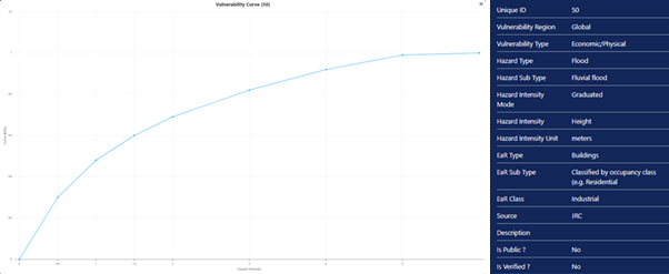
Vulnerability Curve
The related vulnerability tables have been imported and available to the public. Users can use the tables for this exercise.
Vulnerability IDs for Power Sector
Note
Please note that the visualization of Hazard, Elements-at-Risk, and Exposure will affect the calculation of the next step. For example, the classes or value ranges chosen for Hazard and Elements-at-Risk will be applied to calculate Exposure. The same combination which results in the Exposure calculation will then be applied to calculate Loss.
If users would like to calculate a different class or range value, they need to re-calculate the Exposure with the updated class or range value selection before calculating the Loss.
4. Exposure and Loss Calculation Module
With all required input data prepared, users can now proceed to analytical modules. Exposure, Loss, and Risk calculations are performed sequentially, with each module building on the results of the previous one. This structure ensures transparency and traceability in the overall risk assessment process.
Exposure Calculation
Exposure calculation is the first analytical step, quantifying hoe elements-at-risk intersect with hazard intensity. The results serve as the direct input for loss estimation and therefore must be carefully configured and reviewed.
Go to Exposure > Add Exposure. Choose between:
Individual (feature-based): Exposure is calculated for each elements-at-risk feature.
Aggregated (admin unit-based): Exposure is calculated based on admnistrative boundaries.
In the General section, enter the Layer Name and select the Hazard and Elements-at-Risk layers for which the Exposure will be calculated. This setting is used for calculating 5-year return period fluvial undefended flooding to power plant (Individual Exposure)
Layer Name: FluvialFlood_Baseline_PowerPlant_5
Select the Hazard and EaR layers
Hazard: Baseline_Fluvial_Undefended_5y
EaR: Power Plant

Individual Exposure Calculation Settings
For Aggregated Exposure, we need to input several information which are based on the calculated individual exposure. Therefore, we must calculate an associatd Individual Exposure beforehand:
Layer Name: FluvialFlood_Baseline_PowerPlant_5_Agg
Hazard: Baseline_Fluvial_Undefended_5y
Admin Level: Admin_Unit
Once calculated, two tables are obtained from the calculation, which are Summary Table and Detail Table. The Summary Table summarizes the number of exposed Elements-at-Risk by each defined for every hazard class. The Detail Table provides the exposure information for each Element-at-Risk feature.
Both tables will show metrics like:
Exposed fraction
Exposed area / length: Depends on the type of elements-at-risk (polygon / line)
Exposed Population, Value, number of floors: Depends on the information availability in the elements-at-risk attribute data.
Minimum, average, maximum intensity: Only shown in Detail Table.

Exposure Table Results
Users can also show the Summary Table into a chart and export as XLSX. Additionally, users can choose which result to be displayed in the map as well as adjusting the symbology through the Detail and Classes tabs. Observation from the map is also possible by clicking on the features and checking the attributes recorded for each.

Options to display exposure results
Loss Calculation
Loss calculation translates exposure into tangible impacts by applying vulnerability functions and asset attributes. This step estimates physical, economic, or population losses for each element-at-risk and aggregated administrative unit.
Go to Loss > Add Loss. Choose between:
Individual (feature-based): Loss is calculated for each elements-at-risk feature.
Aggregated (admin unit-based): Loss is calculated based on admnistrative boundaries.
In the General section, enter the Layer Name and select the calculated Exposure layer for which the Loss will be calculated. This setting is used for calculating power plant for 5-year return period fluvial undefended flood for baseline scenario, after calculating the individual exposure (Individual Loss).
Layer Name: Loss_Baseline_PowerPlant_5
Select the Exposure layers: FluvialFlood_Baseline_PowerPlant_5.
For Aggregated Loss, the information needed is based on the calculated individual loss. Therefore, we must calculate an associated Individual Loss beforehand:
Layer Name: Loss_Baseline_PowerPlant_5_Agg
Loss: Loss_Baseline_PowerPlant_5
Admin Level: Admin_Unit

Loss Calculation Settings
A series of columns for hazard, loss, and vulnerability is presented to link the elements-at-risk classes to the vulnerability tables. Users need to choose the associated vulnerability table to each class. Users can choose the vulnerability from the All Vulnerability section. After selecting the vulnerability curve, click Save. After linking each class to a particular vulnerability curve, click Save to store and calculate the Loss.
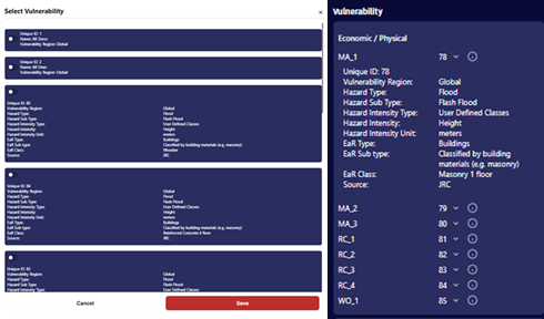
Linking Vulnerability for Loss Calculation
Once the loss is computed, a loss map will be displayed in the map canvas on the right.
Similar to te Exposure module, two Loss tables will be obtained after the calculation which are the Summary Table and the Detail Table.
In addition to the information obtained from the Exposure calculation, the Loss table contains information about Damage Ratio, Loss Fractions, Loss Area / Length, Loss Value, and Loss Population, depending on the information availability in the elements-at-risk attribute data.

Loss Table Result
Users can show the Summary Table into a chart and export the table as XLSX. Additionally, users can also adjust the visualization of the loss map from the Detail and Classes section.

Loss Summary Chart
Risk Calculation
Risk calculation integrates losses across multiple return periods to estimate long-term risk metrics, such as Average Annual Loss. This step enables comparison across areas, hazards, and scenarios and forms the basis for decision-making and risk reduction planning.
For running a risk analysis, aggregated Loss should be calculated beforehand. Additionally, more than one return period Loss for the same Hazard - Elements at Risk combination is required. The calculation up to Loss can follow the steps in previous sections.
Go to Risk > Add Risk. In the General section, enter:
Name: Risk_Fluvial_Baseline_PowerPlant.
Admin Level: Admin_Unit.
Hazard Type: Flood.
Hazard Sub Type: Fluvial Flood.
EaR: Power Plant.
Risk Reduction Alternative and Scenario are optional. Users can select them if they have been defined in the project.
Select Aggregated Losses: The list will be automatically filtered according to the selected Admin Level, Hazard Type/Subtype, and EaR. Select more than one return period Loss layers to be used for Risk calculation.
For this tutorial, we will select Loss_FluvialBaseline_PowerPlant_5_Agg, Loss_FluvialBaseline_PowerPlant_10_Agg, Loss_FluvialBaseline_PowerPlant_50_Agg, Loss_FluvialBaseline_PowerPlant_100_Agg, and Loss_FluvialBaseline_PowerPlant_500_Agg then click Save.
(This setting is used for calculating building average annual loss to fluvial undefended flood for each administrative boundary, after calculating the aggregated loss - Aggrgated Risk)

Risk Calculation Settings
Once the risk is computed, a risk map will be displayed in the map canvas on the right. You can configure how the results are visualized on the map. You can also click individual features to see their attributes. The visualization style can be adjusted from the Detail and Classes sections.

Risk Map
A summary table will be generated after the calculation, showing the Average Annual Loss (AAL) in metrics depending on available Elements-at-Risk attributes for each administrative boundary. For this exercise, the system calculates AAL in terms of Count, Area, Value (USD) and Population (number of people).
You can show the Summary Table into a chart and export the table as XLSX.

Risk Table Result

Risk Summary Chart
Observing the Results
Once all analysis (Exposure, Loss, and Risk) are completed, the results can be visualized, compared, and exported for further exploration. RiskChanges provides options to exports outputs into Geopackage (.gpkg), GeoJSON (.geojson), or Shapefile (.zip) formats, which can be examined using GIS software or integrated into other workflows.
In this chapter, we will discuss how to interpret the results, as well as observing the difference in the outcomes when varying intensity selections are selected.
1. Input Settings Influence on the Calculation
The parameters configuered during data upload and setup significantly influence the computed results of Exposure, Loss, and Risk calculations. The following sections will discuss how different intensity choices affect the final outcomes.
Setting |
Influence on Result |
Example |
|---|---|---|
Hazard Intensity (Min/Avg/Max) |
Determines the calculated exposure area and value for EaR features |
Selecting Max increases exposed buildings compared to Avg |
Vulnerability Curve Selection |
Alters loss ratios and total loss values |
Choosing higher vulnerability curves raises loss and AAL |
Aggregation Level (Admin Units) |
Defines how results are summarized |
Aggregated loss shows total USD per district rather than per site |
Note
Small differences in the selected hazard intensity values can lead to significant variations in the calculated Exposure, Loss, and Risk metrics. It is crucial to carefully consider the intensity selection during the analysis setup.
2. Visualization Settings and Its Limitation
Visualization plays a critical role in interpreting the results of Exposure, Loss, and Risk analyses. However, it is important to understand that visualization settings primarily affect how results are displayed on the map and do not alter the underlying calculations.
RiskChanges uses a classification-based visualization approach, where results are grouped into classes based on user-defined or automated schemes. This method helps in quickly identifying areas of concern but may oversimplify the data.
Style Mode determines how values are grouped for map display.
Color Map aids visual interpretation but does not affect numeric results.
When interpreting visualized results, consider the following:
The map view shows only one layer at a time. Comparing multiple hazards or scenarios may require exporting results.
Legend classificatoin depends on current visualization; swathing between average and maximum intensity requires recassification for accurate display.
For aggregated results, overlapping polygons may make small administrative units less visible.
3. Effect of the Intensity Choice
The Intensity parameter defines which hazard intensity field (Minimum, Average, or Maximum) is visualized and analyzed. While all intensity values are computed internally, only the selected one will be represented on the map.
Example comparison for Flood (20-year return period):
Intensity Type |
Avg Depth (m) |
Exposed Area (m²) |
Loss (USD) |
AAL (USD) |
|---|---|---|---|---|
Minimum Intensity |
0.4 |
12,350 |
48,200 |
9,800 |
Average Intensity |
0.8 |
23,600 |
92,100 |
18,500 |
Maximum Intensity |
1.5 |
41,200 |
175,600 |
34,800 |
As seen above, higher intensity selection results in increased exposure area, loss values, and average annual loss (AAL). This is due to more severe hazard conditions affecting a larger portion of the elements-at-risk.
When conducting analyses, it is essential to choose the intensity level that best represents the scenario being studied, as it directly impacts the risk assessment outcomes.
4. Exposure Results Observation
The Exposure results show which elements are located within hazard zones and the extent of their exposure based on the selected intensity to quantify their potential impact. You can interpret results by:
Spatial distribution: Identify clusters of high exposure along rivers or steep slopes.
Magnitude of impacts: Observe which administrative units contain the most exposed population or building value.
Return period comparison: Longer return periods typically show higher exposure due to larger hazard extents.
Example interpretation:
Buildings in the northern floodplain show 80% exposure at 100-year flood intensity.
Population exposure increases from 15% (20-year) to 45% (200-year).
5. Loss Result Observation
The Loss results indicate the expected damage to elements-at-risk based on their exposure and vulnerability. The results integrate the exposure data with vulnerability curves to estimate potential losses.
Physical loss represents the expected damage to structures and infrastructure in monetary terms.
Population loss indicates estimated affected people based on population vulnerability.
Damage ratio helps understand relative loss per unit value.
Key observation:
Loss concentration usually follows the exposure distribution but may differ due to vulnerability differences.
Reinforced concrete buildings generally show lower ratios than masonry structures under the same hazard intensity.
Comparing alternatives revealrs reduction in total loss values.
6. Risk Result Observation
The Risk module provides an aggregated view of potential annual losses, combining multiple return period loss estimates to calculate the Average Annual Loss (AAL) - the expected yearly loss accounting for hazard frequency and severity.
Interpretation steps:
Identiy hotspots: Administrative units with highest AAL indicate priority areas for mitigation.
Compare hazards: Overlay different hazard risks to identify multi-hazard zones.
Evaluate reduction scenarios: Compare baseline vs alternative scenarios to measure potential benefit.
Example findings:
Admin unit 5 shows the highest flood AAL, mostly driven by residential areas.
Risk reduction scenario A2 reduces AAL by 30% compared to baseline.
7. Exporting and Reporting the Results
After completing the analyses, users can export the results for further examination or reporting. RiskChanges supports exporting data in various formats:
Geopackage (.gpkg) - recommended for GIS analysis with all attributes preserved.
GeoJSON (.geojson) - suitable for web mapping or integration with dashboards.
Shapefile (.zip) - for compatibility with legacy GIS tools.
XLSX table report - for summary statistics or reporting.
Pro Tip: Combine exported exposure, loss, and risk layers in GIS software to create a multi-hazard impact map, overlaying administrative units with population densit to support risk-informed decision-making.