Tutorials (Nocera Demo Dataset)
This section provides step-by-step instructions on how to use the RiskChanges platform. Each section has a detailed video tutorial for better understanding.
About the Demo Dataset
For this tutorial, we’ll be using a demo dataset modeled after the city of Nocera Inferiore, Italy. Please note that the data does not represent real-world conditions and is purely for demonstration purposes within the RiskChanges environment.
Here’s an overview of what’s included in the dataset:
👉 Please refer here to access the dataset for this tutorial.
👉 Check this document for Input Data tutorial and this document for Exposure and Loss Calculation tutorial.
👉 For more details about the dataset structure and use of Alternatives and Scenarios, refer to the dataset document.
Step-by-step Walkthrough
Let’s now go through the core tasks you’ll typically perform on the RiskChanges platform.
1. Register an Account and Setup the Profile
Start by visiting the official RiskChanges website: http://riskchanges.org/. Follow this guide to create your account and set up your profile.
2. Create a Project
To begin working, click the New Project button on the Project Dashboard. This opens a form divided into four sections:  ,
,  ,
,  , and
, and  .
.
Only the General section is required. Let’s fill the required fields with our demo dataset information:
Project Name: Risk City
Study Area: Nocera
Description: This is a demonstration dataset based on Nocera Inferiore, Italy.
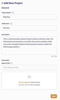
Filling General section
If you want to work collaboratively, go to the Staff tab and invite your team members. You can skip the Alternatives and Scenarios for now or set them later.
Your project will now appear on the dashboard as a card. Use filters to quickly search or sort through multiple projects.
3. Upload and Visualize Data
As mentioned in the user guide, there are several data inputs required for RiskChanges.These include Administrative Boundaries, Hazard Data, Elements-at-Risk (EaR) Data, and Vulnerability Data. You can upload data in various formats including shapefiles, GeoTIFFs, CSVs, and OGC services, depending on each data input.
From your Project Dashboard, click into the project you want to work on. You will see the modules menu on the left side bar.
Administrative Boundary
Choose the Admin Level option and click Add Admin Level. Under the General tab:
Upload a zipped shapefile.
Enter a Name: Admin_Unit
Save.
RiskChanges automatically displays the boundary on the map with default symbology. However, you can customize the visualization by going to the Style tab.
Label Field: [ADMIN UNIT]
Color Map: antiquewhite
Label: Administrative Unit
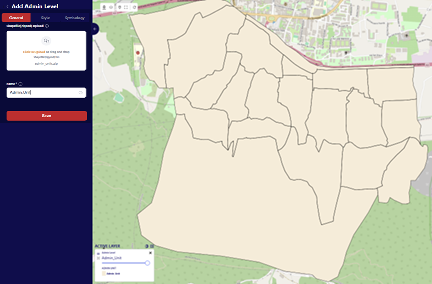
Uploading Administrative Boundary data
Hazard Data
Head over to Hazard > Add Hazard. Upload hazard data in GeoTIFF or zipped shapefile format. Future support will include OGC Service and Global Dataset.
Fill in required fields:
Layer Name, Hazard Type, Sub Type, Intensity Type, Intensity Unit
Return Period, Representation Year, optional Alternative and Scenario
Click Save to apply.
Hazard Name |
Layer Name |
Hazard Type |
Sub Type |
Intensity Type |
Intensity Unit |
Representation Year |
|---|---|---|---|---|---|---|
Debris Flow |
DF_20 |
Mass Movements |
Debris Flows |
Impact Pressure |
kPa |
2020 |
Flood |
FL_20 |
Flood |
Fluvial Flood |
Height |
meters |
2020 |
Landslide |
LS_20_Class |
Mass Movements |
Landslides |
Susceptibility |
classes |
2020 |
Landslide Index |
LS_20_Prob |
Mass Movements |
Landslides |
Susceptibility |
probability |
2020 |
Note
Return periods should be adjusted according to the layers uploaded.
For visualization, RiskChanges supports different visual styles. You can adjust it according to your needs. Use the Style section to adjust the visualization. After adjusting, click Save to apply the changes.
Hazard Name |
Style Mode |
Field |
Min Value |
Max Value |
Classification Method |
Color Map |
|---|---|---|---|---|---|---|
Debris Flow |
User Defined Classes |
[VALUE] |
0.1 |
12.5 |
Quantile |
YlOrBr |
Flood |
User Defined Classes |
[VALUE] |
0.1 |
5.3 |
Quantile |
Blues |
Landslide (Susceptibility Classes) |
Automated Classes |
[VALUE] |
0.1 |
5.3 |
Quantile |
autumn_r |
Landslide Index (Susceptibility Probability) |
User Defined Classes |
[VALUE] |
0.1 |
5.3 |
Quantile |
Wistia |
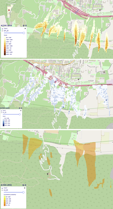
Hazard Visualization
Element-at-Risk (EaR) Data
Go to EaR > Add EaR to upload buildings, roads, or land parcels. You can use either GeoTIFF or shapefiles. Then, define the following fields:
Layer Name
EaR Type / Subtype
Year, optional: Alternative, Scenario
Similarly, use the Style section to adjust the visualization. After adjusting, click Save to apply the changes.
Choose between Single Class, Automated Classes, User Defined Classes.
Define:
Field, Area, Value, Population, Units
Color Map
EaR Name |
Style Mode |
Field |
Area Field |
Area Unit |
Value Field |
Value Unit |
People Field |
People Unit |
** Color Map** |
Building Point |
Automated Classes |
[TYPE] |
[AREA] |
sq.m |
[VALUE] |
USD |
[PEOPLE] |
(number) |
brg_r |
Building Footprints |
Automated Classes |
[USE] |
[AREA_N] |
sq.m |
[VALUE] |
USD |
[PEOPLE] |
(number) |
brg_r |
Roads |
User Defined Classes |
[CALCULATED_AREA_LENGTH] |
– |
– |
– |
– |
– |
autumn_r |
|
Land Parcel |
Automated Classes |
[TYPE] |
[AREA_N] |
sq.m |
[VALUE] |
USD |
[PEOPLE] |
(number) |
brg |
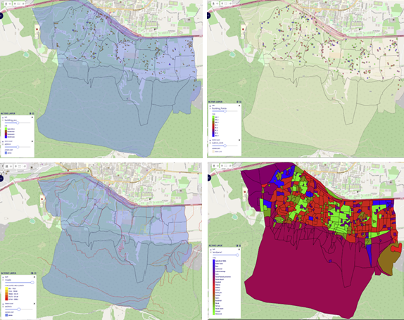
Element-at-Risk Visualization
4. Vulnerability Table
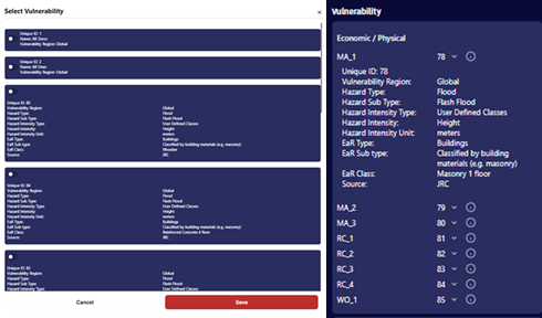
In the Vulnerability tab, you can add a vulnerability curve either by uploading a CSV or filling in data manually. Each record should include: Hazard Intensity From, Hazard Intensity To, Vulnerability Value
Before uploading, you will be asked to provide metadata like:
Vulnerability Region and Type
Hazard Type/Subtype
Intensity Mode and Unit
EaR Type, Subtype, and Class
Source, Description
Public/Private visibility: If marked Public, others can use the record. Otherwise, it will stay under My Vulnerability.
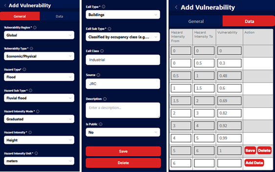
Vulnerability Table Input
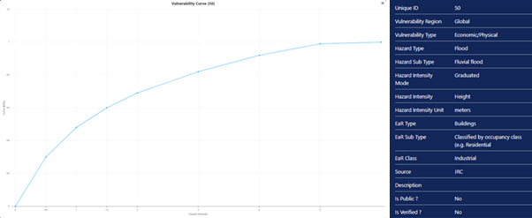
Vulnerability Curve
The related vulnerability tables have been imported and available to the public. Users can use the tables for this exercise.
Vulnerability IDs for Building Materials
ID |
Debris Flow (Physical) |
Flood (Physical) |
Landslide (Physical) |
Debris Flow (Population) |
Flood (Population) |
Landslide (Population) |
|---|---|---|---|---|---|---|
Masonry 1 floor |
86 |
78 |
94 |
162 |
170 |
182 |
Masonry 2 floor |
87 |
79 |
95 |
163 |
171 |
183 |
Masonry 3 floor |
88 |
80 |
96 |
164 |
172 |
184 |
Reinforced Concrete 1 floor |
89 |
81 |
97 |
165 |
173 |
185 |
Reinforced Concrete 2 floor |
90 |
82 |
98 |
166 |
174 |
186 |
Reinforced Concrete 3 floor |
91 |
83 |
99 |
167 |
175 |
187 |
Reinforced Concrete 4 floor |
92 |
84 |
100 |
168 |
176 |
188 |
Wooden |
93 |
86 |
101 |
169 |
177 |
189 |
Vulnerability IDs for Land Parcel Types
ID |
Debris Flow (Physical) |
Flood (Physical) |
Landslide (Physical) |
Debris Flow (Population) |
Flood (Population) |
Landslide (Population) |
|---|---|---|---|---|---|---|
Agricultural Fields |
All 1 |
132 |
135 |
190 |
212 |
234 |
Animal Farm |
102 |
133 |
136 |
191 |
213 |
235 |
Bare |
All 0 |
All 0 |
137 |
192 |
214 |
236 |
Commercial |
103 |
134 |
138 |
193 |
215 |
237 |
Cultural Heritage |
104 |
118 |
143 |
194 |
216 |
238 |
Farm |
105 |
119 |
144 |
195 |
217 |
239 |
Forest Natural |
106 |
120 |
145 |
196 |
218 |
240 |
Forest Planted Protective |
107 |
121 |
146 |
197 |
219 |
241 |
Grassland |
All 1 |
122 |
147 |
198 |
220 |
242 |
Highway |
108 |
123 |
148 |
199 |
221 |
243 |
Industry |
109 |
124 |
149 |
200 |
222 |
244 |
Open Space |
All 0 |
All 0 |
All 0 |
201 |
223 |
245 |
Orchard |
110 |
125 |
150 |
202 |
224 |
246 |
Parking Lot |
111 |
126 |
151 |
203 |
225 |
247 |
Parkland |
112 |
127 |
152 |
204 |
226 |
248 |
Quarry |
113 |
153 |
205 |
227 |
249 |
|
Residential |
114 |
128 |
154 |
206 |
228 |
250 |
Shrubs |
All 1 |
129 |
155 |
207 |
229 |
251 |
Toll Area |
115 |
178 |
208 |
230 |
252 |
|
Tourist Resort |
116 |
130 |
179 |
209 |
231 |
253 |
Vineyard |
All 1 |
131 |
180 |
210 |
232 |
254 |
Water Tank |
117 |
181 |
211 |
233 |
255 |
Note
Vulnerability data is not required for Exposure analysis but is essential for Loss and Risk calculations.
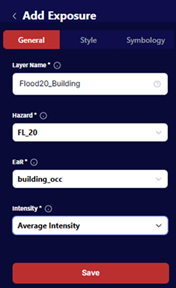
5. Running an Exposure Analysis
Go to Exposure > Add Exposure. Choose between:
Individual (feature-based): Exposure is calculated for each elements-at-risk feature.
Aggregated (admin unit-based): Exposure is calculated based on admnistrative boundaries.
In the General section, enter:
Layer Name: Flood20_Building
Select the Hazard and EaR layers
Choose Intensity: Minimum, Average, or Maximum. These options will affect the layer visualization after the calculation. All intensities will still be calculated and users can change the visualization options afterwards.
(This setting is used for calculating 20-years return period flood to building footprints - Individual Exposure)
Individual Exposure Calculation
For Aggregated Exposure, we need to input several information which are based on the calculated individual exposure. Therefore, we must calculate an associatd Individual Exposure beforehand:
Layer Name: Flood20_Building_Agg
Hazard: Flood20_Building
Admin Level: Admin_Unit
Intensity: Average Intensity
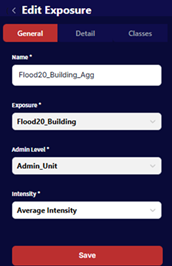
Aggregated Exposure Calculation
Once calculated, two tables are obtained from the calculation, which are Summary Table and Detail Table. The Summary Table summarizes the number of exposed Elements-at-Risk by each defined for every hazard class. The Detail Table provides the exposure information for each Element-at-Risk feature.
Both tables will show metrics like:
Exposed fraction
Exposed area / length: Depends on the type of elements-at-risk (polygon / line)
Exposed Population, Value, number of floors: Depends on the information availability in the elements-at-risk attribute data.
Minimum, average, maximum intensity: Only shown in Detal Table.
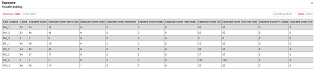
Exposure Table Result (Summary Table)
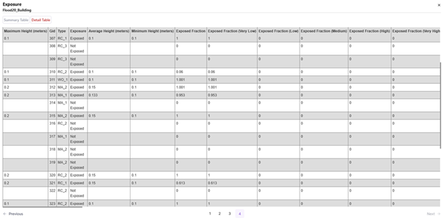
Exposure Table Result (Detail Table)
For the Aggregated Exposure result, a summary table will be generated after the calculation, showing the total Exposure in metrics depending on available Elements-at-Risk attributes for each administrative boundary. For this exercise, we obtain Exposure in terms of Area, Value (USD) and Population (number of people).
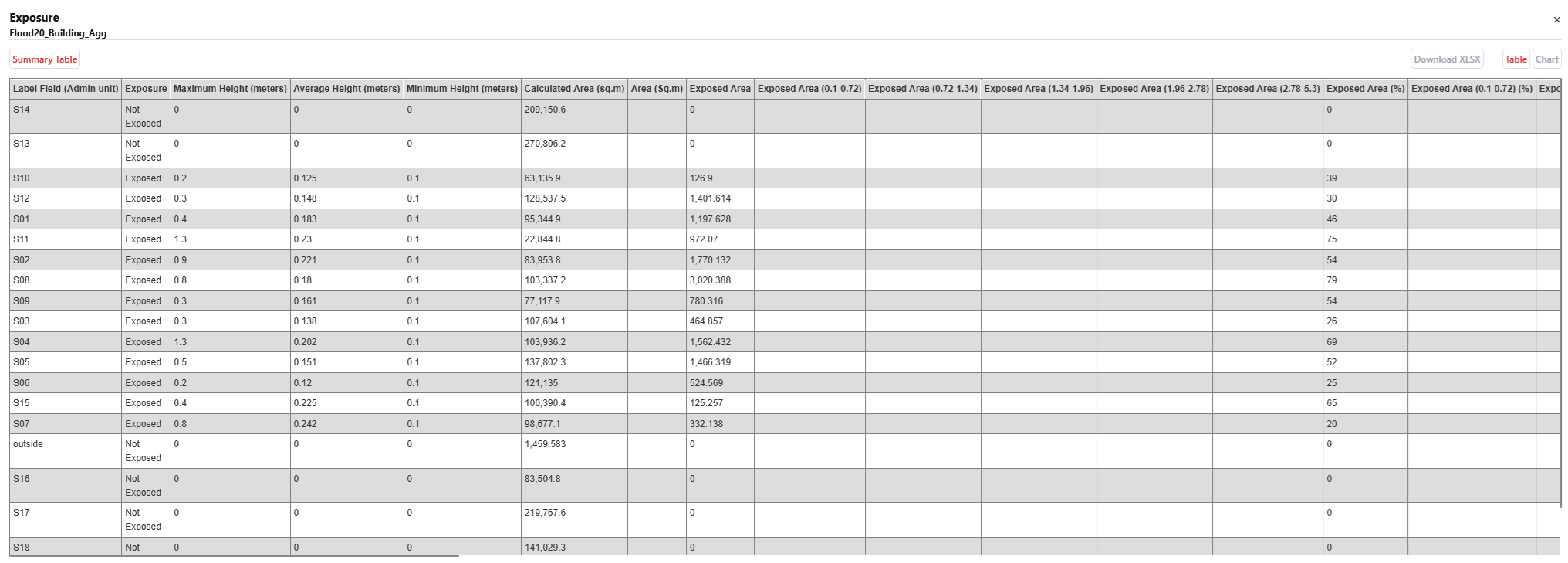
Aggregated Exposure Table Result
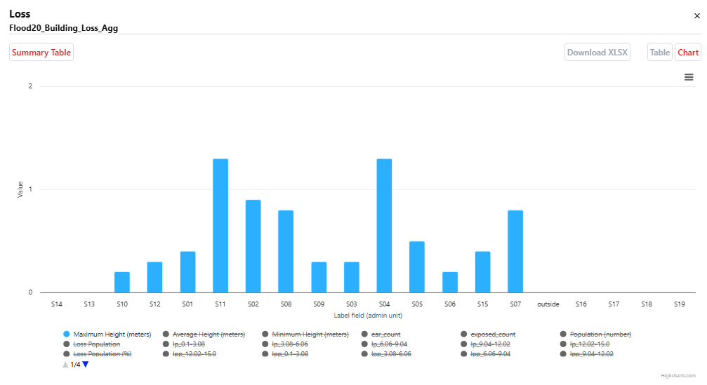
You can show the Summary Table into a chart and export the table as XLSX.
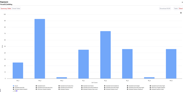
Exposure Summary Chart
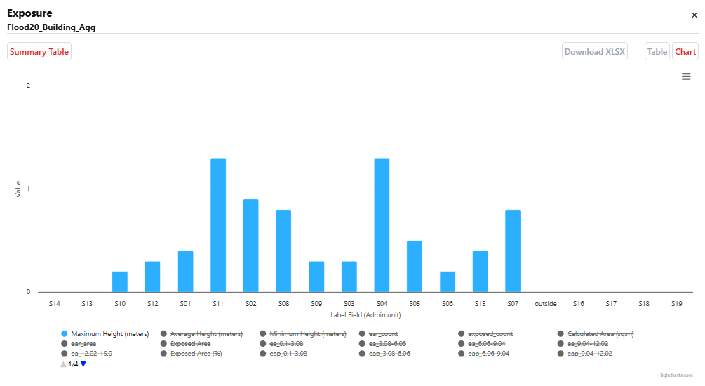
Aggregated Exposure Chart
You can configure how the results are visualized on the map. You can also click individual features to see their attributes.
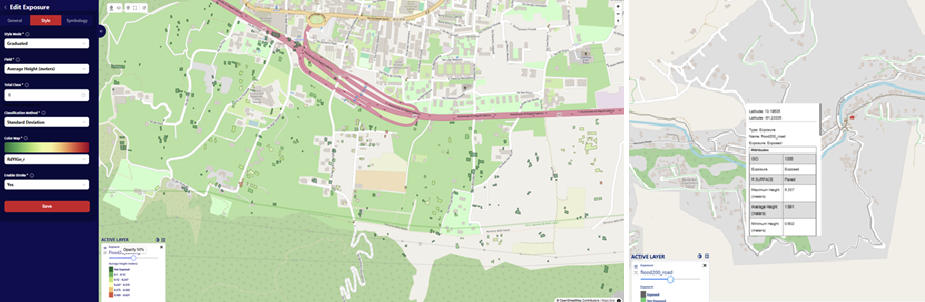
Exposure Visualization
Note
Visualization directly affects how the calculations for Exposure, Loss, and Risk are performed. If you want to try different classes or value ranges for your analysis, you’ll need to re-run the Exposure module before running Loss or Risk again.
6. Running a Loss Analysis
Go to Loss > Add Loss. Choose between:
Individual (feature-based): Loss is calculated for each elements-at-risk feature.
Aggregated (admin unit-based): Loss is calculated based on admnistrative boundaries.
In the General section, enter:
Layer Name: Flood20_Building_Loss
Select the Exposure layers: Flood20_Building.
(This setting is used for calculating building loss to 20-year return period flood, after calculating the individual exposure - Individual Loss)
For Aggregated Loss, the information needed is based on the calculated individual loss. Therefore, we must calculate an associated Individual Loss beforehand:
Layer Name: Flood20_Building_Loss_Agg
Loss: Flood20_Building_Loss
Admin Level: Admin_Unit
Intensity: Average Intensity
Loss Calculation
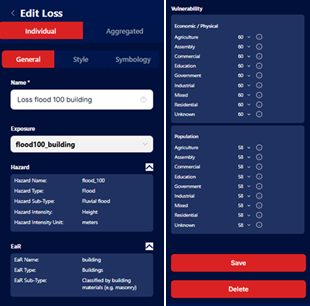
A series of columns for hazard, loss, and vulnerability is presented to link the elements-at-risk classes to the vulnerability tables. Users need to choose the associated vulnerability table to each class. Users can choose the vulnerability from the All Vulnerability section. After selecting the vulnerability curve, click Save. After linking each class to a particular vulnerability curve, click Save to store and calculate the Loss.
Linking Vulnerability for Loss Calculation
Once the loss is computed, a loss map will be displayed in the map canvas on the right.
Similar to te Exposure module, two Loss tables will be obtained after the calculation which are the Summary Table and the Detail Table.
In addition to the information obtained from the Exposure calculation, the Loss table contains information about Damage Ratio, Loss Fractions, Loss Area / Length, Loss Value, and Loss Population, depending on the information availability in the elements-at-risk attribute data.
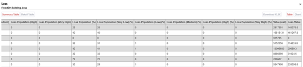
Loss Table Result (Summary Table)
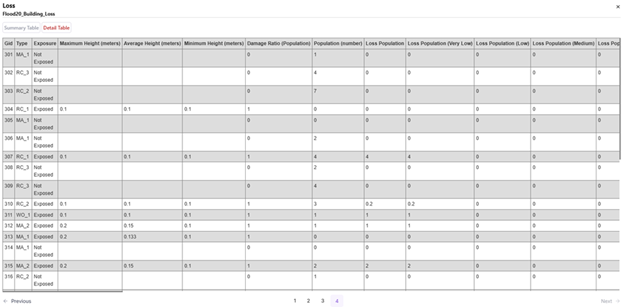
Loss Table Result (Detail Table)
For the Aggregated Loss result, a summary table will be generated after the calculation, showing the total Loss in metrics depending on available Elements-at-Risk attributes for each administrative boundary. For this exercise, we obtain Loss in terms of Area, Value (USD) and Population (number of people).
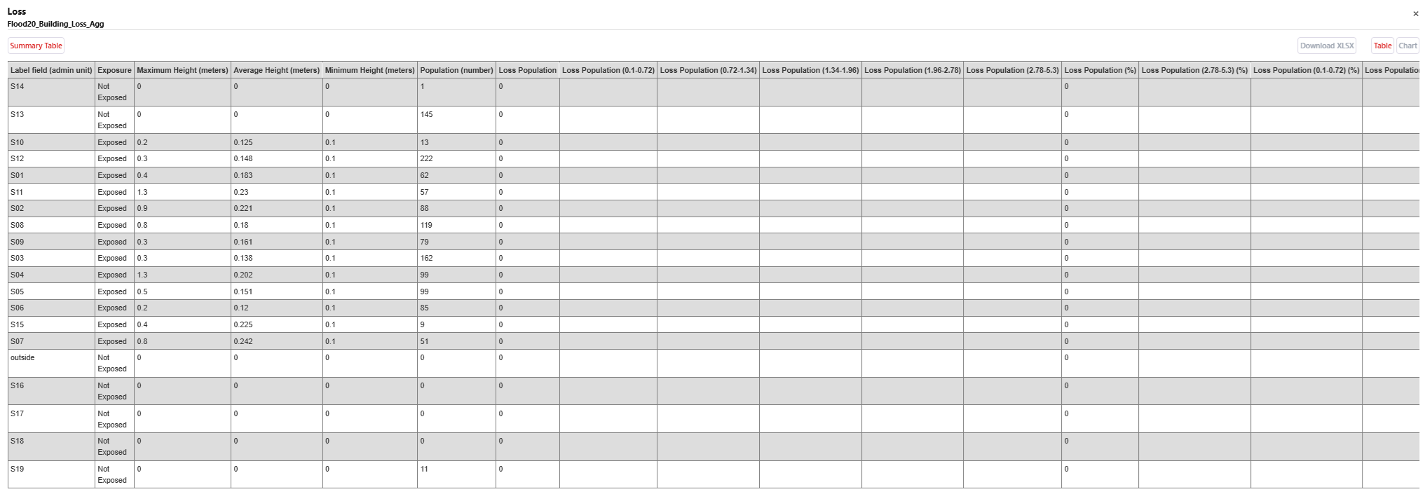
Aggregated Loss Table Result
You can show the Summary Table into a chart and export the table as XLSX.
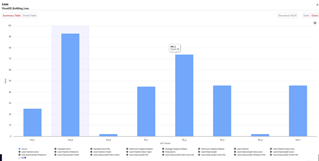
Loss Summary Chart
Aggregated Loss Chart
You can configure how the results are visualized on the map. You can also click individual features to see their attributes. The visualization style can be adjusted from the Detail and Classes sections.
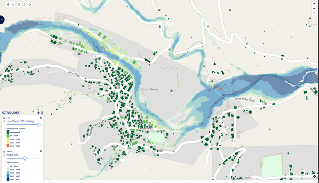
Loss Visualization
7. Running a Risk Analysis
For running a risk analysis, aggregated Loss should be calculated beforehand. Additionally, more than one return period Loss for the same Hazard - Elements at Risk combination is required. The calculation up to Loss can follow the steps in previous sections.
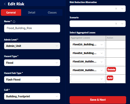
Go to Risk > Add Risk. In the General section, enter:
Name: Flood_Building_Risk.
Admin Level: Admin_Unit.
Hazard Type: Flood.
Hazard Sub Type: Flash Flood.
EaR: Building_Footprint.
Risk Reduction Alternative and Scenario are optional. Users can select them if they have been defined in the project.
Select Aggregated Losses: The list will be automatically filtered according to the selected Admin Level, Hazard Type/Subtype, and EaR. Select more than one return period Loss layers to be used for Risk calculation.
For this tutorial, we will select Flood20_Building_Loss_Agg, Flood50_Building_Loss_Agg, Flood100_Building_Loss_Agg, and Flood200_Building_Loss_Agg, then click Save.
(This setting is used for calculating building average annual loss to flood for each administrative boundary, after calculating the aggregated loss - Aggrgated Risk)
Risk Calculation
Once the risk is computed, a risk map will be displayed in the map canvas on the right. You can configure how the results are visualized on the map. You can also click individual features to see their attributes. The visualization style can be adjusted from the Detail and Classes sections.
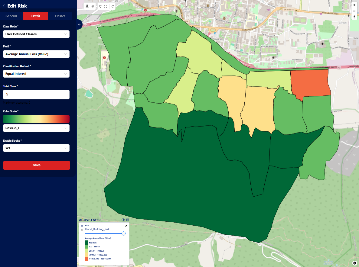
Risk Map and Visualization Settings
A summary table will be generated after the calculation, showing the Average Annual Loss (AAL) in metrics depending on available Elements-at-Risk attributes for each administrative boundary. For this exercise, we obtain AAL in terms of Count, Area, Value (USD) and Population (number of people).
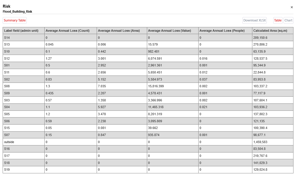
Risk Table Result
You can show the Summary Table into a chart and export the table as XLSX.
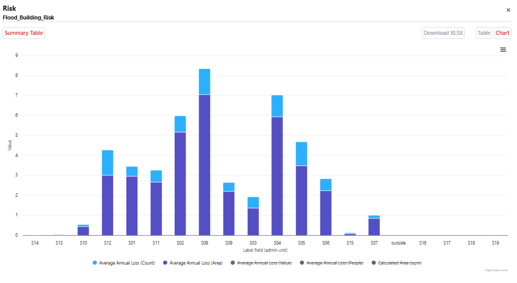
Risk Summary Chart
Scenario, Alternative, and Cost-Benefit Analysis
This section introduces the Scenario, Alternative, and Cost-Benefit Analysis (CBA) modules in RiskChanges.
Note
This tutorial assumes that all hazards, elements-at-risk (EAR), and vulnerability data have already been uploaded. Please refer to steps above before proceeding.
Scenarios represent possible future developments (e.g., climate change, land use, population growth).
Alternatives represent risk reduction measures (e.g., engineering solution, nature-based solution, relocation).
CBA compares alternatives to identify the most optimal solution.
Scenario Module
The Scenario module allows users to define future conditions and assess their impact on hazard, exposure, and risk. In this tutorial, we will be using the following scenarios:
Name |
Land Use Change |
Climate Change |
|---|---|---|
Scenario 1 (Business as Usual) |
Rapid growth without risk consideration |
Limited change |
Scenario 2 (Risk Informed Planning) |
Growth considering risk and planning alternatives |
Limited change |
Scenario 3 (Worst Case) |
Rapid growth without risk consideration |
Increased extreme events |
Scenario 4 (Climate Change Adaptation) |
Risk-informed growth |
Increased extreme events |
Note
Only two land parcel maps and two hazard maps are required:
Scenario 1 & 2 share the same hazard map
Scenario 2 & 4 share the same land parcel map
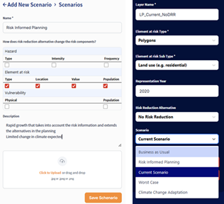
To add a new scenario, follow the steps below:
Go to Project Dashboard → Project Settings
Select Scenarios
Click Add Scenario
Fill in:
Scenario Name
Risk components affected
Description (optional)
Upload supporting files (optional)
You may refer to the following table for the scenario settings used in this tutorial.
Scenario |
Hazard Intensity |
Hazard Frequency |
EaR Type |
EaR Location |
EaR Value |
EaR Population |
|---|---|---|---|---|---|---|
Current |
No |
No |
No |
No |
No |
No |
Business as Usual |
No |
No |
Yes |
Yes |
Yes |
Yes |
Risk Informed Planning |
No |
No |
Yes |
Yes |
Yes |
Yes |
Worst Case |
Yes |
Yes |
Yes |
Yes |
Yes |
Yes |
Climate Change Adaptation |
Yes |
Yes |
Yes |
Yes |
Yes |
Yes |
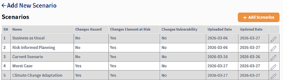
The submitted Scenario records will be displayed in the Scenario table and can be chosen when uploding the Hazard or Elements-at-Risk datasets representing the Scenario.
Alternative Module
Alternative represent risk reduction strategies evaluated in the system. The following alternatives are used in this tutorial:
Alternative |
Description |
|---|---|
Engineering Solutions |
Structural measures such as basins, slope stabilization, and monitoring systems |
Ecological Solutions |
Nature-based solutions such as trees, water tanks, and natural parks |
Relocation |
Moving exposed population to safer areas |
Warning
Alternatives 1 and 2 require new hazard and land parcel maps, while Alternative 3 uses the existing hazard data.
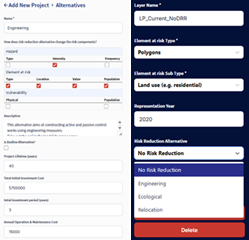
To add a new alternative, follow the steps below:
Go to Project Dashboard → Project Settings
Select Alternatives
Click Add Alternative
Fill in:
Name
Risk components affected
Description
Project Lifetime: Duration of evaluation
Total Investment Cost: Initial cost
Investment Period: Time before benefits start
Maintenance Cost: Annual cost
Note
Investment costs can be estimated by:
Calculating affected areas or assets
Applying unit costs (e.g., per m² or per building)
The table below summarizes the cost parameters for the alternatives used in this tutorial.
Parameter |
Engineering |
Ecological |
Relocation |
|---|---|---|---|
Benefit Start Year |
4 |
6 |
3 |
Total Investment Cost (USD) |
9,801,016 |
17,158,442 |
4,493,700 |
Annual Maintenance (USD) |
294,030 |
343,168 |
0 |
Discount Rate |
3% |
3% |
3% |
Project Lifetime |
40 years |
40 years |
40 years |
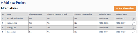
The submitted Alternative records will be displayed in the Alternative table and can be chosen when uploding the Hazard or Elements-at-Risk datasets representing the Alternative.
Uploading Data for Scenarios and Alternatives
When uploading Hazard or EAR datasets:
Select the corresponding Scenario
Select the corresponding Alternative
Note
Vulnerability only requires assigning the appropriate curve.
Exposure, Loss, and Risk Calculation
For each alternative or scenario combinations, repeat the same steps from the above sections to calculate Exposure, Loss, and Risk. This allows you to compare the outcomes of different scenarios and alternatives.
Warning
Ensure correct combinations of Scenario and Alternative are selected.
Cost-Benefit Analysis (CBA)
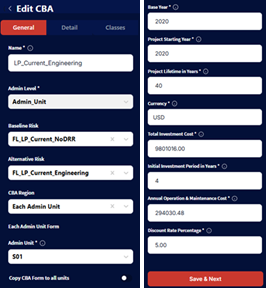
Go to CBA Module
Click Add CBA
Fill in:
Name: LP_Current_Engineering
Admin Level: Admin_Unit
Baseline Risk: FL_LP_Current_NoDRR
Alternative Risk: FL_LP_Current_Engineering
CBA Region: Entire Region / Admin Unit
The ‘Entire Region’ option is used for calculating cost-benefit analysis for the entire region of the administrative unit. For ‘Each Admin Unit’, if users choose this option, the CBA will be calculated only on the selected administrative unit chosen by the user. Users can also select the option to apply the whole CBA form to all administrative units.
For the CBA form, the users need to fill in the following columns:
Base Year: 2020
Project Start Year: 2020
Project Lifetime: 40 years
Currency: USD
Investment Cost: 9,801,016
Investment Period: 4 years
Maintenance Cost: 294,030
Discount Rate: 5%
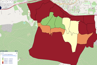
Once the CBA is computed, a CBA map will be displayed in the map canvas on the right. Similar to previous modules, users can modify the visualization and choose the relevant attributes to be shown on the map.
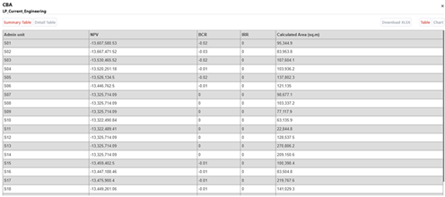
A Summary table and chart will be obtained after the calculation. This table contains information about NPV, BCR and IRR. The administrative level shown depends on the chosen CBA Region. This table is downloadable into XLSX format.
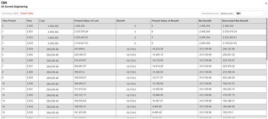
A Detail table and chart are also available, showing the annual benefit calculations. This table contains information on annual cost, present value of cost. Benefit, present value of benefit, net benefit, and discounted net benefit. This table is downloadable into XLSX format.
Note
Tables can be exported as XLSX.
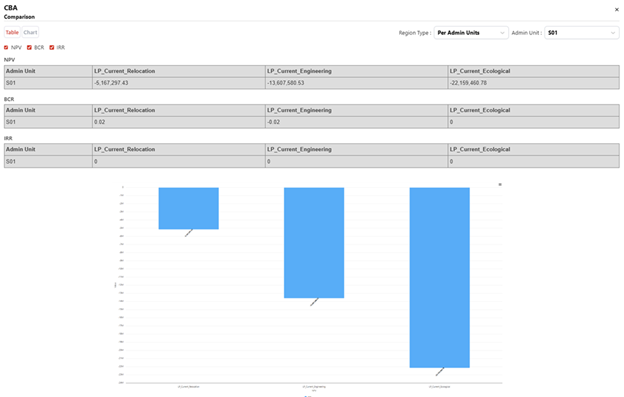
When multiple CBA result layers are activated, users can compare the results using the Compare button. This feature allows users to compare different alternatives by IRR, NPV, and BCR to identify the most optimal alternative. The comparison is available in both table and charts.
Observing the Results
Once all analysis (Exposure, Loss, and Risk) are completed, the results can be visualized, compared, and exported for further exploration. RiskChanges provides options to exports outputs into Geopackage (.gpkg), GeoJSON (.geojson), or Shapefile (.zip) formats, which can be examined using GIS software or integrated into other workflows.
In this chapter, we will discuss how to interpret the results, as well as observing the difference in the outcomes when varying intensity selections are selected.
1. Input Settings Influence on the Calculation
The parameters configuered during data upload and setup significantly influence the computed results of Exposure, Loss, and Risk calculations. The following sections will discuss how different intensity choices affect the final outcomes.
Setting |
Influence on Result |
Example |
|---|---|---|
Hazard Intensity (Min/Avg/Max) |
Determines the calculated exposure area and value for EaR features |
Selecting Max increases exposed buildings compared to Avg |
Vulnerability Curve Selection |
Alters loss ratios and total loss values |
Choosing higher vulnerability curves raises loss and AAL |
Aggregation Level (Admin Units) |
Defines how results are summarized |
Aggregated loss shows total USD per district rather than per site |
Note
Small differences in the selected hazard intensity values can lead to significant variations in the calculated Exposure, Loss, and Risk metrics. It is crucial to carefully consider the intensity selection during the analysis setup.
2. Visualization Settings and Its Limitation
Visualization plays a critical role in interpreting the results of Exposure, Loss, and Risk analyses. However, it is important to understand that visualization settings primarily affect how results are displayed on the map and do not alter the underlying calculations.
RiskChanges uses a classification-based visualization approach, where results are grouped into classes based on user-defined or automated schemes. This method helps in quickly identifying areas of concern but may oversimplify the data.
Style Mode determines how values are grouped for map display.
Color Map aids visual interpretation but does not affect numeric results.
When interpreting visualized results, consider the following:
The map view shows only one layer at a time. Comparing multiple hazards or scenarios may require exporting results.
Legend classificatoin depends on current visualization; swathing between average and maximum intensity requires recassification for accurate display.
For aggregated results, overlapping polygons may make small administrative units less visible.
3. Effect of the Intensity Choice
The Intensity parameter defines which hazard intensity field (Minimum, Average, or Maximum) is visualized and analyzed. While all intensity values are computed internally, only the selected one will be represented on the map.
Example comparison for Flood (20-year return period):
Intensity Type |
Avg Depth (m) |
Exposed Area (m²) |
Loss (USD) |
AAL (USD) |
|---|---|---|---|---|
Minimum Intensity |
0.4 |
12,350 |
48,200 |
9,800 |
Average Intensity |
0.8 |
23,600 |
92,100 |
18,500 |
Maximum Intensity |
1.5 |
41,200 |
175,600 |
34,800 |
As seen above, higher intensity selection results in increased exposure area, loss values, and average annual loss (AAL). This is due to more severe hazard conditions affecting a larger portion of the elements-at-risk.
When conducting analyses, it is essential to choose the intensity level that best represents the scenario being studied, as it directly impacts the risk assessment outcomes.
4. Exposure Results Observation
The Exposure results show which elements are located within hazard zones and the extent of their exposure based on the selected intensity to quantify their potential impact. You can interpret results by:
Spatial distribution: Identify clusters of high exposure along rivers or steep slopes.
Magnitude of impacts: Observe which administrative units contain the most exposed population or building value.
Return period comparison: Longer return periods typically show higher exposure due to larger hazard extents.
Example interpretation:
Buildings in the northern floodplain show 80% exposure at 100-year flood intensity.
Population exposure increases from 15% (20-year) to 45% (200-year).
5. Loss Result Observation
The Loss results indicate the expected damage to elements-at-risk based on their exposure and vulnerability. The results integrate the exposure data with vulnerability curves to estimate potential losses.
Physical loss represents the expected damage to structures and infrastructure in monetary terms.
Population loss indicates estimated affected people based on population vulnerability.
Damage ratio helps understand relative loss per unit value.
Key observation:
Loss concentration usually follows the exposure distribution but may differ due to vulnerability differences.
Reinforced concrete buildings generally show lower ratios than masonry structures under the same hazard intensity.
Comparing alternatives revealrs reduction in total loss values.
6. Risk Result Observation
The Risk module provides an aggregated view of potential annual losses, combining multiple return period loss estimates to calculate the Average Annual Loss (AAL) - the expected yearly loss accounting for hazard frequency and severity.
Interpretation steps:
Identiy hotspots: Administrative units with highest AAL indicate priority areas for mitigation.
Compare hazards: Overlay different hazard risks to identify multi-hazard zones.
Evaluate reduction scenarios: Compare baseline vs alternative scenarios to measure potential benefit.
Example findings:
Admin unit 5 shows the highest flood AAL, mostly driven by residential areas.
Risk reduction scenario A2 reduces AAL by 30% compared to baseline.
7. Exporting and Reporting the Results
After completing the analyses, users can export the results for further examination or reporting. RiskChanges supports exporting data in various formats:
Geopackage (.gpkg) - recommended for GIS analysis with all attributes preserved.
GeoJSON (.geojson) - suitable for web mapping or integration with dashboards.
Shapefile (.zip) - for compatibility with legacy GIS tools.
XLSX table report - for summary statistics or reporting.
Pro Tip: Combine exported exposure, loss, and risk layers in GIS software to create a multi-hazard impact map, overlaying administrative units with population densit to support risk-informed decision-making.